Start with the campaign’s brand context
Accessibility checks work best when they begin before copy, video, or design is treated as final. For small teams and agencies, the first review should confirm the campaign’s purpose, audience, approved language, and brand profile. This gives reviewers a practical basis for deciding whether the content is understandable and appropriate across the brands they manage.
Ask whether the intended message can be understood without relying on a particular image, sound, colour, gesture, or inside reference. A campaign can be visually consistent with a brand while still making its essential point clear in plain language. If the main action, offer, date, or next step appears only in a graphic, it should be represented in accompanying text as well.
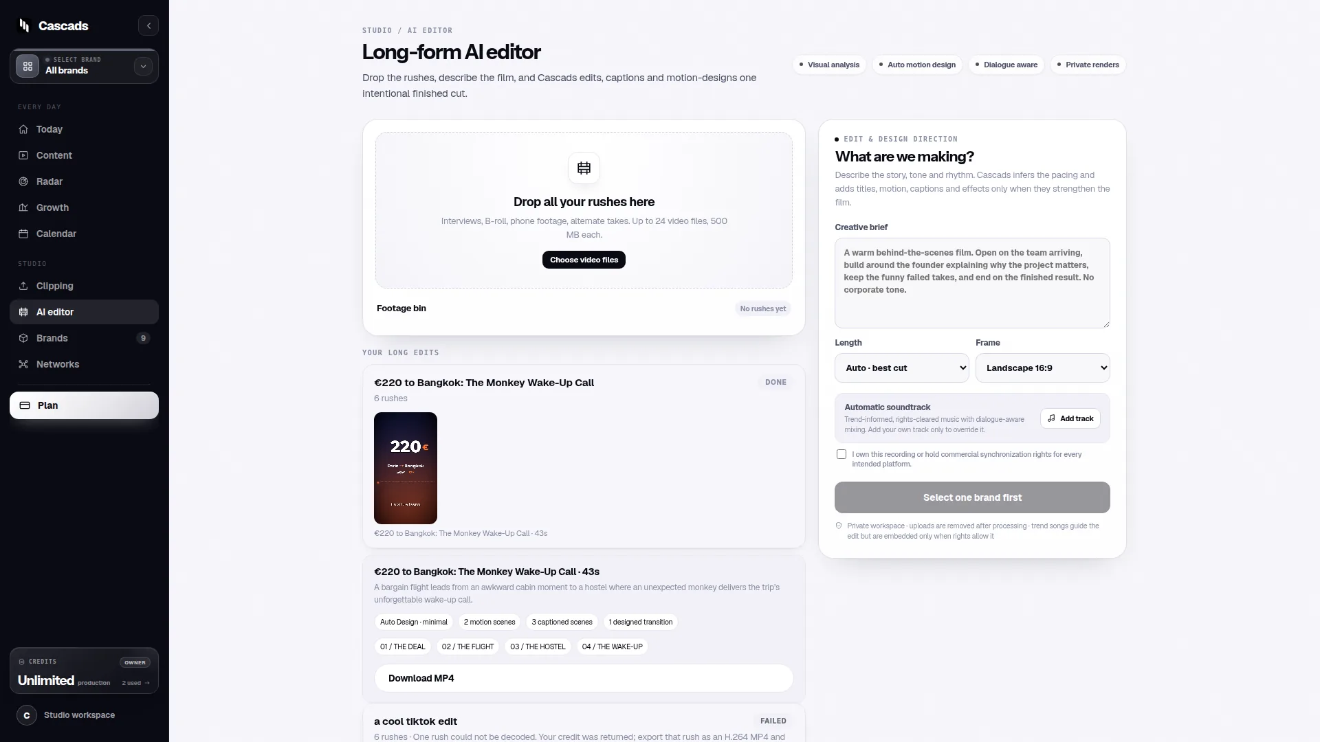
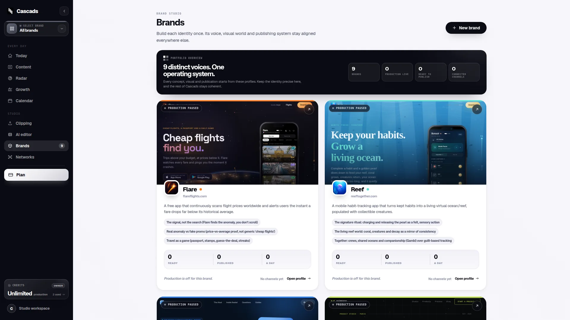
Cascads is an IVRYN product for social content production and scheduling. Its reusable profile for each brand can support a more consistent starting point for generated text posts, vertical videos, and carousels. The profile should still be reviewed for language choices, terminology, and campaign-specific context before output is prepared for publishing.
- Confirm the campaign goal and intended action are stated in clear text.
- Check brand terminology for unexplained abbreviations or internal phrasing.
- Make sure important details are not available only through a visual or audio element.
Check text posts for clarity and structure
For text-first posts, accessibility is largely a question of clarity, structure, and readable context. Review the opening line to ensure it identifies the subject without requiring readers to infer it from an image or previous post. Then check that the call to action explains what will happen next and does not rely on vague directions such as “click here” when a clearer instruction is possible.
Keep sentences direct enough to scan on a mobile screen. Long, dense paragraphs, repeated punctuation, stylised character substitutions, and unexplained hashtags can make a post harder to read. This does not require every brand to sound identical; it means each brand’s voice should remain understandable when read quickly or through assistive technology.
Hashtags, mentions, and links deserve a separate pass. Use them where they add useful context, but avoid allowing them to interrupt the core message. When a link leads to a registration page, product page, or resource, describe that destination in the surrounding copy so the reader understands its purpose before following it.
- State the main message before supporting detail.
- Use descriptive calls to action and link context.
- Limit decorative punctuation and unexplained shorthand.
- Review hashtags and mentions for readability and relevance.
Review vertical videos for more than visuals
A vertical video should communicate its main idea even when a viewer cannot rely fully on sound or on-screen visuals. Before shipping, verify that essential spoken information is represented through accurate captions or equivalent on-screen text. Captions should reflect the meaningful speech, not simply provide a vague summary when the wording matters.
Also review the relationship between narration and visuals. If the video demonstrates a process, names a product feature, shows a price, or asks viewers to choose between options, include enough spoken or textual explanation to make the point understandable without only watching the screen. Avoid presenting critical instructions in fast-moving text that disappears before it can reasonably be read.
Timing matters as well. Give key messages sufficient screen time, avoid abrupt transitions that conceal the campaign’s action, and make on-screen text readable against its background. A review can catch cases where a visually polished video still depends on small type, low contrast, or an unexplained image sequence.
- Check captions for completeness and accuracy.
- Confirm important visuals are explained in narration or text.
- Review text size, contrast, pacing, and screen duration.
- Ensure the final call to action is visible and understandable.
Make carousels usable slide by slide
Carousels often carry a sequence: a promise on the first slide, supporting detail in the middle, and a call to action at the end. Review each slide as though it may be encountered separately. The slide should have enough context to be meaningful, particularly if it contains a statistic, instruction, product name, or visual comparison.
Do not use slide order as the only way to communicate essential information. A reader who stops after one slide should still understand the topic and the brand’s intended message. When a process genuinely requires sequence, label the steps clearly and repeat the relevant context where it prevents confusion.
Inspect visual hierarchy closely. Text over imagery, tiny footnotes, charts without textual explanation, and colour-only distinctions can weaken a carousel’s usefulness. Convert key comparisons into words, label visual markers, and make the final action clear in the caption as well as on the slide.
- Give each slide a clear topic or labelled step.
- Do not communicate meaning through colour alone.
- Explain charts, comparisons, and visual categories in text.
- Repeat the campaign action in the post caption where appropriate.
Example: a practical shipping decision aid
Example: An agency is preparing a campaign for two brands. One brand needs a text post and carousel announcing a limited registration period; the other needs a vertical video inviting viewers to a product demonstration. The team uses each brand’s reusable profile in Cascads to generate draft formats, then treats accessibility as a release decision rather than a final cosmetic edit.
For the registration carousel, the reviewer checks that the registration dates, eligibility details, and action are stated in the caption and not confined to the final slide. They check every slide for readable text and replace a colour-only “open” versus “closed” indicator with labels. For the video, the reviewer checks that the invitation, date, and next step appear in captions or on-screen text, and that the visual demonstration is described clearly enough to follow.
The campaign is ready for the next publishing check only when each format passes its own review. If the copy is clear but the carousel contains unreadable detail, the carousel is not ready. If the video relies on spoken instructions without captions, the video is not ready. This approach keeps a single campaign from being approved merely because one format is complete.
- If essential information is visual-only, add textual context.
- If essential information is audio-only, add captions or equivalent text.
- If a slide or frame needs more time to read, revise timing or reduce content.
- If the call to action changes by network, review that version separately.
Use human review and format-aware publishing
Generated marketing output remains subject to human review before publication. That review should include accessibility alongside accuracy, brand fit, and campaign intent. A useful final pass assigns clear responsibility: one person confirms the content itself is understandable, while another, where practical, confirms that the selected network and publishing setup can support the prepared format.
Format-aware publishing is important because direct publishing depends on the network, media format, account permissions, and external platform approval. A campaign may be ready in editorial terms but still need adaptation because a chosen network or account configuration does not support the planned publishing path. Treat that as a publishing constraint to resolve, not as evidence that the content review can be skipped.
Before scheduling, compare the final text, video, or carousel against the version that was approved. Check captions, visual text, links, slide order, and any network-specific copy. If a format must be changed for a network, return it to human review so that accessibility checks apply to the changed version rather than only to the original draft.
- Approve the actual version scheduled for each network.
- Re-review any format, caption, or call-to-action changes.
- Confirm publishing feasibility for the selected network and account.
- Keep human review as the final release gate.
Frequently asked questions
What is the most important accessibility check before a social campaign ships?
Confirm that the campaign’s essential message, action, and key details can be understood without depending only on an image, colour cue, sound, or fast-moving visual.
Should accessibility be checked separately for posts, videos, and carousels?
Yes. Text posts need clear language and descriptive context, vertical videos need accessible treatment of spoken and visual information, and carousels need each slide and sequence reviewed for readability and meaning.
Does scheduled publishing remove the need for a final review?
No. Scheduled publishing does not replace human review. The final version for each network should be checked for accessible content and for any format-specific publishing constraints before it is released.
Sources and further reading
These resources provide the wider reference frame. Product statements on this page are limited to the public information provided by Cascads.